Tout savoir sur le Lucky cat et sa signification
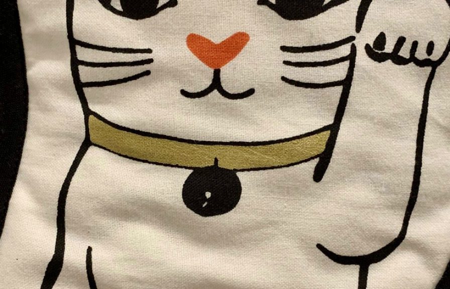
Le « maneki-neko », ou chat porte-bonheur (« Lucky Cat » en anglais) est un objet de décoration issu du folklore Japonais. Il s’agit d’une statuette qui représente un petit chat assit, levant une patte au niveau de son oreille, et que l’on trouve à l’entrée des commerces ou à l’intérieur des foyers japonais. Son nom signifie littéralement « le chat qui invite » (« Maneki » signifie « inviter », « saluer », et « Neko » signifie « chat »). Dans la tradition japonaise, le maneki-neko attire la richesse et la chance….